Insights | September, 2026
Designing Accessible Digital Products for Better User Experiences
BrandubeLearn how thoughtful accessibility practices can make digital products easier to use, more inclusive, and more effective across different users, devices, and abilities.

Table of Content
Overview Introduction Understand Digital Accessibility Design Clear and Understandable Interfaces Make Navigation Easy to Use Design for Keyboard and Alternative Input Use Accessible Color and Visual Design Create Accessible Content and Forms Design for Different Devices and Conditions Test Accessibility with Real Users Build Accessibility into the Product Process Common Accessibility Mistakes to Avoid Conclusion Frequently Asked QuestionsOverview
Digital products are used by people with different abilities, devices, environments, preferences, and levels of technical experience. Designing for accessibility helps ensure that more people can understand, navigate, and interact with a product effectively.
Accessibility is not simply a technical requirement added at the end of development. It is a design consideration that can influence navigation, content, visual hierarchy, interaction patterns, forms, media, and the overall user experience.
When accessibility is considered from the beginning, digital products can become easier to use for a broader range of people while also creating clearer and more consistent experiences for everyone.
Introduction
A digital product may be technically functional while still being difficult for some users to understand or operate. Small design decisions can create significant barriers when interfaces rely heavily on color, precise mouse movements, unclear labels, complex navigation, or content that is difficult to perceive.
Accessible design takes these different situations into account. It encourages teams to think about how people interact with products using keyboards, screen readers, touch interfaces, different display settings, assistive technologies, or under temporary environmental limitations.
The objective is not to create separate experiences for different groups of users. It is to create flexible and thoughtful experiences that work effectively across a wider range of users and situations.
Understand Digital Accessibility
Digital accessibility means designing and developing digital products so that people with different abilities can perceive, understand, navigate, and interact with them.
Accessibility can involve visual, auditory, motor, cognitive, and other considerations. It can also benefit people who may not identify as having a permanent disability. Someone using a phone in bright sunlight, recovering from an injury, working in a noisy environment, or using a device with a slow connection can also benefit from accessible and resilient design.
Accessibility should therefore be considered as part of good product design rather than as a narrow feature for a specific audience.
- Perceivable: Information and interface elements should be available in ways users can perceive.
- Understandable: Content, navigation, and interactions should be clear and predictable.
- Operable: Users should be able to interact with important functionality through appropriate input methods.
- Flexible: The experience should work across different devices, settings, and user situations.
- Consistent: Accessibility should be considered throughout the entire product experience.
Design Clear and Understandable Interfaces
Clear visual and interaction design can make a product easier to understand for everyone. Users should be able to quickly identify important information, understand available actions, and recognize the relationship between different parts of the interface.
Strong visual hierarchy helps users understand what matters most on a screen. Clear headings, descriptive labels, logical grouping, sufficient spacing, and predictable interaction patterns can reduce unnecessary cognitive effort.
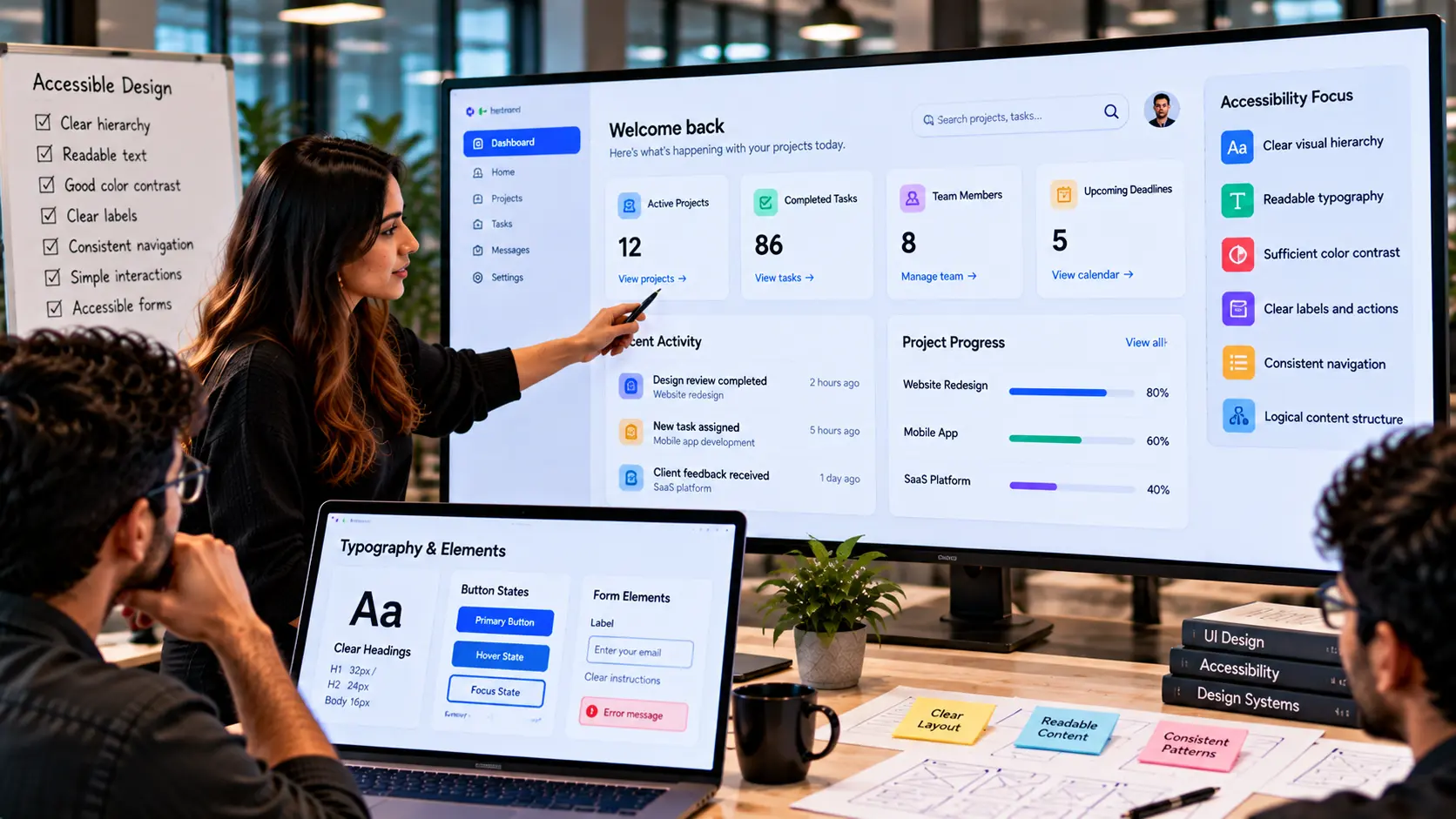
Interfaces should also avoid relying on visual decoration when communicating important information. An icon, color, or animation may support an interaction, but essential information should remain understandable without depending on a single visual cue.
- Use clear hierarchy: Organize content so users can understand its structure quickly.
- Write descriptive labels: Make buttons, links, fields, and actions clear.
- Keep interactions predictable: Similar actions should behave consistently.
- Reduce unnecessary complexity: Avoid adding interaction patterns that make simple tasks harder.
- Provide useful feedback: Clearly communicate errors, success, progress, and changes.
Make Navigation Easy to Use
Navigation is one of the most important parts of an accessible digital product. Users need to understand where they are, where they can go, and how to return to previous areas without unnecessary effort.
Navigation should follow a logical structure and use meaningful labels. Important controls should be easy to identify, while page layouts should remain consistent across different sections of the product.
Clear navigation also benefits users who rely on assistive technologies because predictable page structures make it easier to understand the available content and actions.
- Use meaningful navigation labels: Help users understand where each link or control leads.
- Maintain consistency: Keep navigation patterns predictable across the product.
- Provide clear page structure: Use headings and logical sections to organize information.
- Make important controls discoverable: Avoid hiding essential actions behind unclear interactions.
- Support efficient navigation: Reduce unnecessary steps for frequently used tasks.
Design for Keyboard and Alternative Input
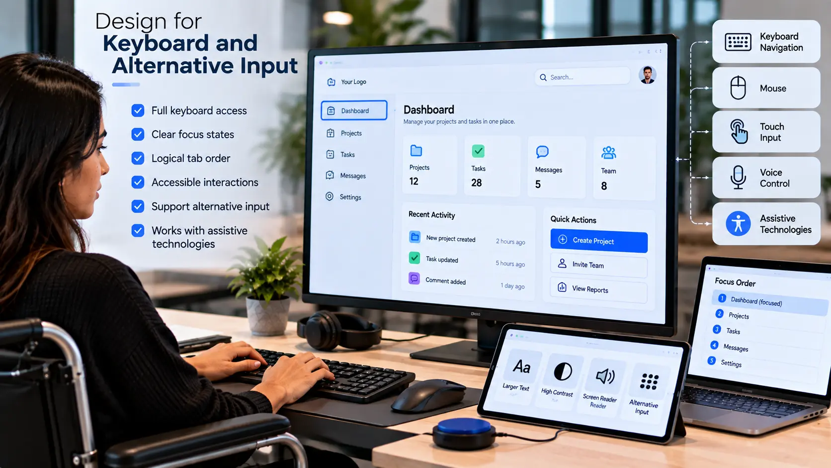
Not every user interacts with a digital product using a mouse or touchscreen. Some users rely on keyboards, switches, voice control, screen readers, or other assistive technologies.
Interactive elements should therefore be usable through appropriate input methods. Users should be able to move through important controls in a logical order and understand which element currently has focus.
Buttons, links, menus, forms, dialogs, and other interactive components should behave predictably regardless of the input method being used.
- Support keyboard interaction: Important actions should be accessible without requiring a mouse.
- Use logical focus order: The sequence of interactive elements should make sense.
- Make focus visible: Users should be able to identify the active interface element.
- Use meaningful controls: Interactive elements should clearly communicate their purpose.
- Test interactive components: Check menus, forms, dialogs, and other controls using alternative input methods.
Use Accessible Color and Visual Design
Color is an important part of interface design, but it should not be the only way important information is communicated.
For example, an error message should not depend solely on red text or a colored border. Supporting text, icons, labels, or other visual cues can provide additional context.
Typography, spacing, contrast, and visual hierarchy also influence how easily users can perceive and understand content. Interfaces should remain usable across different display conditions and user preferences wherever practical.
- Do not rely only on color: Use additional cues when communicating important information.
- Maintain readable text: Choose typography and sizing that support comfortable reading.
- Use sufficient contrast: Make important content and interface elements distinguishable.
- Keep visual hierarchy clear: Help users identify relationships between content and actions.
- Consider different environments: Think about how the interface behaves in bright, dark, or distracting conditions.
Create Accessible Content and Forms
Content and forms are central to many digital product experiences. Poorly structured content or unclear forms can create unnecessary friction even when the underlying product functionality works correctly.
Use clear headings, descriptive links, meaningful labels, and straightforward instructions. Form fields should communicate what information is expected, while errors should explain what went wrong and how users can correct the problem.
- Use descriptive headings: Organize content into meaningful sections.
- Label form fields clearly: Make the required information easy to understand.
- Explain errors: Tell users what went wrong and how to resolve it.
- Provide useful instructions: Explain complex requirements before users make an error.
- Write clear content: Use straightforward language and avoid unnecessary complexity.
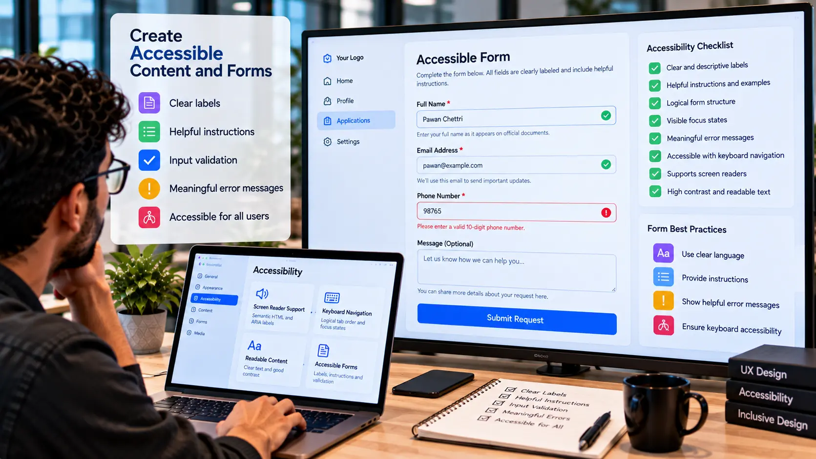
Clear content benefits users who rely on assistive technologies as well as users who simply want to complete tasks quickly and confidently.
Design for Different Devices and Conditions
Digital products are used in many different environments. Users may access the same product from a desktop computer, tablet, mobile phone, or another device with different screen sizes and input methods.
Responsive design helps interfaces adapt to different screen dimensions, but accessibility also requires thinking about different conditions and interaction patterns.
A product should remain understandable and functional when users adjust text size, use different input methods, experience temporary physical limitations, or operate in challenging environments.
- Support responsive layouts: Ensure important content remains usable across screen sizes.
- Consider touch interaction: Make important controls practical to operate on touch devices.
- Support different text settings: Avoid layouts that become unusable when text is enlarged.
- Consider network conditions: Avoid making essential functionality dependent on unnecessarily heavy resources.
- Test across devices: Evaluate important user journeys in realistic environments.
Test Accessibility with Real Users
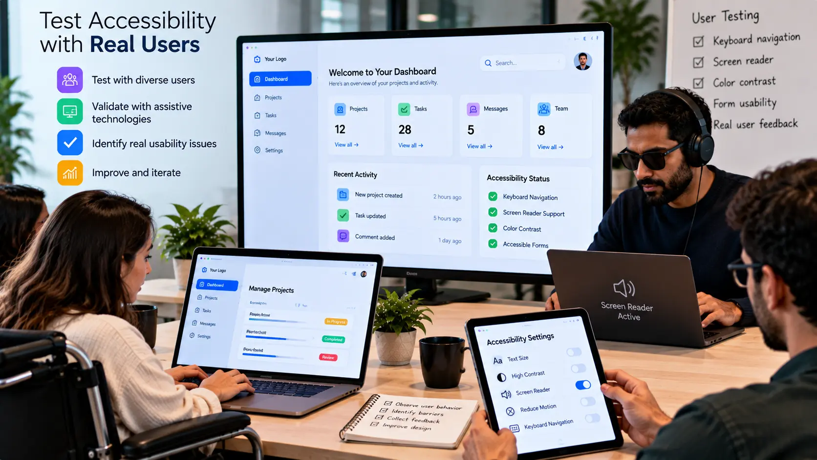
Design reviews and automated tools can identify many accessibility issues, but they cannot replace testing with real people and realistic usage scenarios.
Accessibility testing can involve keyboard navigation, screen readers, different display settings, mobile devices, browser variations, and users with different needs and abilities.
Testing should focus on important user journeys rather than only individual interface elements. A product may have accessible components while still creating barriers when those components are combined into a complete workflow.
- Test core journeys: Evaluate the tasks users need to complete most often.
- Use multiple input methods: Test keyboards, touch, and other relevant interaction methods.
- Check content structure: Verify that headings, labels, links, and forms remain understandable.
- Test different devices: Review experiences across relevant screen sizes and environments.
- Include diverse users: Where possible, involve people with different abilities and experiences.
Build Accessibility into the Product Process
Accessibility becomes easier to maintain when it is integrated into the product process from the beginning. Treating accessibility as a final checklist can result in expensive changes and missed issues.
Designers can consider accessibility while creating user flows, wireframes, interfaces, and design systems. Developers can incorporate accessible interaction patterns and test them during implementation. Product teams can include accessibility considerations in requirements and acceptance criteria.
Design systems can also help create consistency. Reusable accessible components reduce the likelihood of introducing the same interaction problem repeatedly across different parts of a product.
- Include accessibility in requirements: Consider accessibility before development begins.
- Design accessible components: Build reusable patterns that support different users.
- Test during development: Identify issues before they become difficult to change.
- Include accessibility in reviews: Make it part of normal design and development quality checks.
- Maintain accessibility over time: Review new features and updates before release.
Common Accessibility Mistakes to Avoid
Accessibility problems often come from small decisions that are repeated throughout a digital product. Identifying common patterns can help teams avoid unnecessary barriers.
- Relying only on color: Important information should not depend on color alone.
- Using unclear labels: Buttons, links, and form fields should communicate their purpose.
- Ignoring keyboard users: Important functionality should not require a mouse or touchscreen.
- Creating poor focus states: Users should be able to identify the active interactive element.
- Using complex forms: Forms should provide clear labels, instructions, and useful error messages.
- Ignoring responsive behavior: Interfaces should remain usable across different screen sizes and settings.
- Testing only at the end: Accessibility should be considered throughout design, development, and ongoing product updates.
The goal is not simply to identify accessibility problems after a product is built. It is to create a development process where accessibility becomes part of how digital experiences are designed and maintained.
Conclusion
Accessible digital products are designed with a broader understanding of how people interact with technology. Clear interfaces, logical navigation, meaningful content, flexible interaction methods, and thoughtful visual design can help make products easier to use across different users and situations.
Accessibility should not be treated as a final technical task. It should influence product strategy, UX/UI design, development, testing, and ongoing product improvements.
By considering accessibility from the beginning and validating experiences with real users, teams can identify barriers earlier and create more flexible digital products.
When accessibility becomes part of the product development process, the result is not only a more inclusive experience but also a clearer, more consistent, and more resilient digital product.
Frequently Asked Questions
- What is digital accessibility?
Digital accessibility is the practice of designing and developing digital products so people with different abilities, devices, and interaction methods can perceive, understand, navigate, and use them effectively. - Why is accessibility important in UX design?
Accessibility helps reduce barriers and creates experiences that are easier to understand and use across a wider range of users and situations. - Should accessibility be considered during the design stage?
Yes. Considering accessibility during UX/UI design can help prevent problems before they become more difficult and expensive to change during development. - How can I make a website easier to navigate?
Use logical page structures, meaningful navigation labels, consistent layouts, clear headings, predictable interactions, and easily discoverable controls. - Why should interfaces not rely only on color?
Some users may have difficulty distinguishing certain colors, and information can also be missed in different display conditions. Supporting color with labels, icons, text, or other cues creates a clearer experience. - How can accessibility be tested?
Accessibility can be evaluated through design reviews, automated testing, keyboard testing, assistive technology testing, device testing, and testing important workflows with real users. - Does accessibility only benefit users with disabilities?
No. Accessible design can also help people using different devices, working in challenging environments, experiencing temporary limitations, or simply preferring clearer and more flexible interfaces. - How can accessibility be maintained after launch?
Include accessibility in design reviews, development testing, new feature requirements, quality checks, user research, and ongoing product development so new changes do not introduce unnecessary barriers.

Insights | September, 2026
How to Plan a Successful Digital Product MVP Before Development
Discover how defining the right MVP scope, validating core ideas, and prioritizing essential features can help teams reduce complexity and build products with greater clarity.
Brandube

Insights | September, 2026
Mastering Your Digital Product Strategy for Success
Unlock long-term product success by learning how to build a strategic digital experience around your users, goals, and business needs.
Brandube

Insights | September, 2026
Web Development Essentials for Fast, Scalable, and Reliable Websites
Explore the core development principles that help businesses build fast, secure, scalable websites designed for reliable performance and long-term growth.