Insights | September, 2026
Designing Scalable Design Systems for Consistent Digital Experiences
BrandubeDiscover how a well-structured design system improves consistency, speeds up product design, and creates a more connected experience across digital platforms.

Table of Content
Overview Introduction What Is a Design System? Why Design Systems Matter for Digital Products Core Elements of a Scalable Design System Creating Consistency Across Digital Experiences Building Reusable Components Design Systems and Development Collaboration How to Keep a Design System Scalable Common Design System Mistakes to Avoid Conclusion Frequently Asked QuestionsOverview
As digital products grow, maintaining a consistent user experience across pages, features, devices, and platforms becomes increasingly difficult. Different designers may create similar interfaces in different ways, while development teams may implement components with small variations that gradually create inconsistency.
A scalable design system provides a structured foundation for solving this challenge. It brings together reusable components, design principles, patterns, guidelines, and visual foundations that help teams create digital experiences with greater consistency and efficiency.
More than a collection of UI elements, a strong design system creates a shared language between design and development. It helps teams work faster, reduces unnecessary duplication, and makes it easier to evolve a digital product as new features and requirements emerge.
Introduction
Modern digital products are rarely limited to a handful of screens. Websites, web applications, mobile applications, SaaS platforms, and software products can contain hundreds of interfaces and interaction states.
Without a clear system, teams can gradually introduce inconsistencies in typography, spacing, colors, buttons, forms, navigation, and other interface elements. These differences may appear small individually, but together they can create a fragmented experience for users.
A design system helps establish shared rules for how an interface should look and behave. Instead of designing or developing every component from scratch, teams can work from a consistent foundation that supports both current requirements and future product growth.
The goal is not to prevent creativity. A well-designed system creates structure around the recurring parts of a product while allowing teams to focus their creative energy on solving meaningful user and business problems.
What Is a Design System?
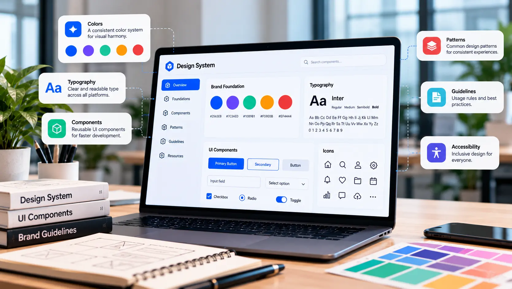
A design system is a collection of reusable design elements, principles, components, patterns, and guidelines used to create consistent digital experiences.
It can include foundational elements such as color, typography, spacing, grids, icons, and elevation, as well as reusable interface components such as buttons, forms, cards, navigation systems, modals, tables, and notifications.
A mature design system can also document interaction patterns, accessibility considerations, content guidelines, responsive behavior, and usage rules. This gives teams a shared reference for making design and implementation decisions.
The most effective systems are treated as evolving product assets rather than static documents. As the digital product changes, the design system should also be reviewed, improved, and expanded to support new requirements.
Why Design Systems Matter for Digital Products
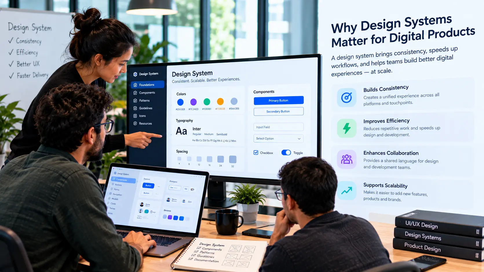
Consistency is one of the most visible benefits of a design system, but its value extends beyond visual appearance. A well-structured system can influence how quickly teams design, develop, test, and maintain digital products.
Reusable components reduce the need to recreate common interface elements repeatedly. Designers can work from established patterns, while developers can build from components that have already been considered and tested.
Design systems can also improve collaboration. When designers and developers use shared terminology and component structures, conversations become more precise and misunderstandings can be reduced.
For users, consistency makes interfaces easier to understand. When familiar patterns behave consistently across a product, users spend less time learning individual screens and more time completing their intended tasks.
As products expand, these advantages become increasingly valuable because the system provides a framework for maintaining quality without requiring every decision to start from zero.
Core Elements of a Scalable Design System
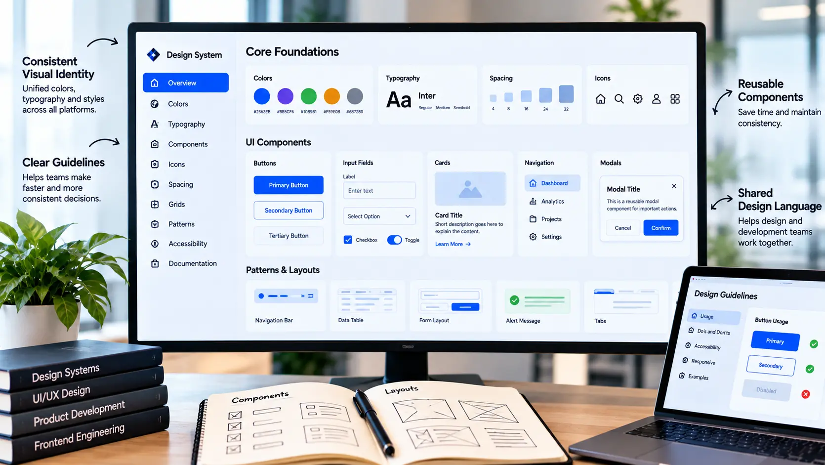
A scalable design system should be organized around the needs of the product and the teams using it. While every system is different, several foundational elements are commonly important.
- Design foundations: Define typography, colors, spacing, grids, icons, sizing, borders, and other visual foundations that create a consistent interface language.
- Reusable components: Create flexible UI components that can be reused across multiple screens and product areas.
- Interaction patterns: Establish consistent behaviors for navigation, forms, dialogs, notifications, loading states, and other common interactions.
- Usage guidelines: Explain when and how components should be used so teams can make consistent decisions.
- Accessibility principles: Include accessibility considerations throughout components and interaction patterns rather than treating them as a final-stage requirement.
- Documentation: Maintain clear documentation that helps designers and developers understand available components, their variations, and appropriate use cases.
Creating Consistency Across Digital Experiences
Consistency does not mean that every screen needs to look identical. It means users should encounter familiar visual and interaction principles throughout the product.
A design system helps establish consistency across different pages, features, devices, and even product platforms. For example, a primary action should maintain a recognizable visual hierarchy, while common form controls should behave predictably wherever they appear.
Responsive behavior is another important consideration. Components should be designed with different screen sizes and contexts in mind so that the experience remains coherent across desktop, tablet, and mobile environments.
Content and interaction patterns should also be considered. Consistent labels, error messages, confirmation states, and navigation behaviors can make a product feel significantly more predictable and easier to use.
Building Reusable Components
Reusable components are at the heart of a scalable design system. Instead of treating every button, card, input, or navigation element as a separate design, teams can create flexible components that support multiple contexts.
The key is designing components around meaningful variations rather than creating endless one-off versions. A button, for example, may need different states such as default, hover, active, disabled, and loading, but those states can still belong to one structured component.
Components should also account for real product requirements. Responsive behavior, different content lengths, accessibility requirements, validation states, and edge cases should be considered before a component becomes widely adopted.
Well-designed components reduce duplication while giving teams enough flexibility to address different product scenarios. This balance between consistency and flexibility is essential for long-term scalability.
Design Systems and Development Collaboration
A design system becomes significantly more effective when designers and developers contribute to it together. A system that exists only in a design tool may not always match the components implemented in the actual product.
Close collaboration helps ensure that design components and development components share the same structure, terminology, states, and intended behavior.
Developers can provide valuable technical insight into component architecture, performance, responsive behavior, and implementation constraints. Designers can help ensure that these technical implementations remain aligned with the intended user experience.
This shared approach can create a stronger connection between design and development and reduce the gap between design specifications and the final product.
How to Keep a Design System Scalable
Creating a design system is only the beginning. As products evolve, new features, technologies, platforms, and user requirements can introduce pressure on the original system.
Regular maintenance is therefore essential. Teams should review components, identify duplication, remove outdated patterns, and introduce new components only when there is a clear product need.
Governance can also help maintain quality. Teams may establish guidelines for proposing new components, modifying existing patterns, documenting changes, and communicating updates across design and development.
A scalable system should also remain flexible. Overly rigid rules can prevent teams from solving legitimate product problems, while a system with too little structure can quickly become inconsistent.
The strongest systems evolve alongside the product while protecting the principles that create consistency and usability.
Common Design System Mistakes to Avoid
Design systems can create significant value, but poor planning and maintenance can make them difficult to use or scale. Several common mistakes should be avoided.
- Building components without real use cases: Creating a large library of components before understanding actual product requirements can add unnecessary complexity.
- Focusing only on visual design: A useful system should also address interaction behavior, accessibility, responsive behavior, content, and development requirements.
- Creating too many variations: Excessive variations can make a system difficult to understand and can reduce the consistency it was designed to create.
- Ignoring development: A design system should have a strong relationship with the actual product implementation.
- Failing to document usage: Components without clear guidance can be interpreted differently by different team members.
- Never updating the system: Outdated components and patterns can create friction and encourage teams to create unofficial alternatives.
Conclusion
A scalable design system provides a strong foundation for creating consistent, efficient, and adaptable digital products. By establishing shared foundations, reusable components, interaction patterns, and clear guidelines, teams can reduce unnecessary duplication while creating more connected user experiences.
The value of a design system grows when it becomes part of the relationship between design and development rather than remaining a collection of static assets. Collaboration, documentation, governance, and continuous improvement all contribute to its long-term usefulness.
Ultimately, a successful design system should make digital product teams more consistent without making them less flexible. It should provide the structure needed to scale while leaving enough room to solve new user and business challenges.
When thoughtfully designed and continuously maintained, a design system becomes an important foundation for building digital experiences that remain coherent as products, teams, and user needs grow.
Frequently Asked Questions
- What is a design system?
A design system is a structured collection of reusable design elements, components, patterns, principles, and guidelines that help teams create consistent digital experiences. - Why is a design system important for digital products?
It helps improve consistency, reduce duplicated work, support collaboration between design and development, and make digital products easier to scale and maintain. - What should a design system include?
A design system can include typography, colors, spacing, grids, icons, reusable components, interaction patterns, accessibility guidelines, documentation, and development resources. - How does a design system improve UX?
Consistent interface patterns make digital products more predictable and easier to understand, helping users recognize familiar elements and interactions across different parts of the experience. - Can a design system work for both websites and apps?
Yes. A design system can support websites, web applications, mobile applications, SaaS products, and other digital platforms when its components and guidelines are designed around the needs of those experiences. - How do designers and developers use a design system together?
Designers can use shared components and patterns during product design, while developers can implement corresponding components in the product. Shared terminology and documentation help maintain alignment between both sides. - How often should a design system be updated?
A design system should evolve as the product changes. Teams can review components and patterns regularly, remove outdated elements, and introduce improvements when new product requirements justify them. - Does a design system limit creativity?
A well-designed system does not need to limit creativity. By providing structure for recurring interface elements, it allows teams to spend more time solving meaningful product and user experience challenges.

Insights | September, 2026
Web Development Essentials for Fast, Scalable, and Reliable Websites
Explore the core development principles that help businesses build fast, secure, scalable websites designed for reliable performance and long-term growth.
Brandube

Insights | June, 2025
How User Research Shapes Better Digital Product Experiences
Discover how meaningful user research reveals behaviors, expectations, and pain points that lead to more relevant and effective digital experiences.
Brandube

Insights | September, 2026
A Practical Guide to Building High-Performance Web Applications
Discover the key considerations for developing web applications that deliver reliable performance, scalable architecture, intuitive experiences, and long-term value.